Watch Complications Update
The Snaplists watchOS app offers a complication the user can add to [almost?] any watch face. The complication is just a static image (the app icon) that launches the app. As an Apple Watch enthusiast, I think it’s important to offer this feature for those users that want quick access to an app on the watch.
For a while now, I have been aware of an issue with the graphicCircular complication where the icon, which was supposed to be a circular app icon, had flat edges making it not quite a perfect circle. The issue was occuring on Series 7/8 Apple Watches, which have a slightly larger screen than previous models.
You can see the complication with flat sides in the top-left and bottom-center of this screenshot. The date complication in the lower-left, which is provided by watchOS, has the desired perfect circle shape.
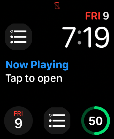
I believe the issue was due to there only being complication images for the 40 & 44mm screen sizes in the asset catalog in Xcode. (The app and these images were created before the release of the Series 7 watch). The gray background was simply part of the image, and the image size wasn’t correct for the larger watch screen size. The way the complication images were configured in the asset catalog, “slots” were presented only for the 40 & 44mm screen sizes. But, Apple’s Human Interface Guidelines lists different complication image sizes for the 41 & 45mm screen sizes of the Series 7/8 watches and the 49mm screen size of the new Apple Watch Ultra.
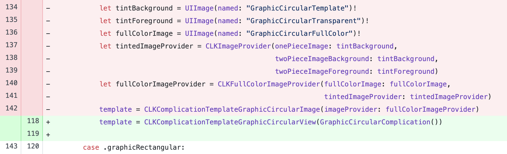
Possibly I could have changed these settings in the asset catalog and provided a single vector image that would be resized for the different screen sizes, but it would have required creating new PDF assets to drop in the asset catalog. Instead, I chose to use SwiftUI to fix the issue. Since watchOS 7, it has been possible to provide some watch complications as SwiftUI views. For the fix, I would create a SwiftUI view that rendered the background as a color instead of an image.
The new SwiftUI view for the complication is very simple:
struct GraphicCircularComplication: View {
    @Environment(\.complicationRenderingMode) var mode

    var body: some View {
        ZStack {
            if mode == .fullColor {
                Color("GraphicComplicationBackground")
            }

            Image("Complication/Graphic Circular")
        }
    }
}
The check for mode == .fullColor above is so the background color is not rendered in a tinted presentation.
The above SwiftUI view is used with ClockKit’s CLKComplicationTemplateGraphicCircularView, which masks the view as a perfect circle when rendering the complication for the watch face.
The code in the app’s ComplicationController class is much simpler using SwiftUI vs the older approach of using ImageProvider classes. Also, fewer images are required as now only a template image for the icon’s foreground is needed. The gray background is rendered in SwiftUI as a background color for the view instead of an image.
With the above changes, the graphic complications now render as perfect circles 🎉
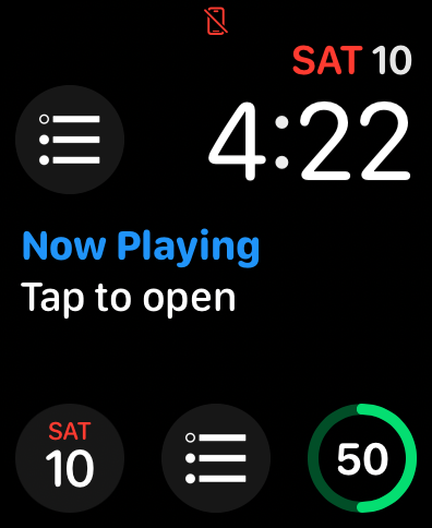
Technically, the app is still only supplying two different image sizes for all the different watches, but now that only the app icon foreground is in the image, and the background is handled by SwiftUI, the complications look “ok” on all watch sizes (in my opinion 🙂). Also, I am aware that ClockKit has been deprecated and the new way to make watch complications is with WidgetKit, but that requires watchOS 9 and I am still targeting watchOS 8. So I will continue to use ClockKit for now.
Version 2022.12 of Snaplists, with these watch complication updates, is now available in the App Store.
NOTE: I removed this app from the App Store on May 27, 2024. Read about why here.